
Your website is doing more work than you think.
Developers and PMs look at it after somebody passes along your name. Good people look at it before deciding whether to apply. Subs look at it before chasing your bid list. Architects look at it before recommending you. So do bonding agents and bankers.
For most of them it’s the first real look at your company. Whatever impression it leaves is the one they carry into the first call.
Most contractor websites leave a weak one, not necessarily because they look bad. Plenty of them look fine. They just leave out the handful of things people came there to find and the key things that actually move the needle.
We pulled up twenty commercial construction websites to see who’s actually doing it well. Single-office regional builders up to a $4.4 billion national CM.
Here’s what the good ones do, what almost nobody does, and five things to check on your own site.
The five checks
Run these on your own site. It takes about ten minutes and it’ll tell you more than most website proposals will.
1. Does it look professional? People make this call in about two seconds, before they’ve read a word. It needs to look current, load quickly, and work properly on a phone.
2. Do they build what I’m building? This is the big one. Somebody with a medical office building wants to see a medical office building, ideally around their size and in their market. If you’re smaller, you answer that by being specific about what you do. If you’re bigger, you answer it with navigation that gets people to their kind of work quickly. What doesn’t answer it for anybody is a wall of project photos in no particular order, which is what most sites are.
3. Is there proof? Proof means evidence from somebody other than you — your own claims about quality don’t really count. Real photos of finished work, client names people recognize, and somebody willing to say you were good to work with. It also needs to be reasonably current, because if the newest job on there wrapped up in 2019, you’ve just answered a question nobody asked.
4. Are there real people on it? Faces. Not so a developer can go look up your estimator, it’s simpler than that — a site with people on it feels like a company, and a site without them feels like a brochure somebody printed once.
5. Can I get to a person? A name, an email, a direct line. Not a contact form that may or may not go anywhere.
How we did this
Twenty commercial contractors in three groups: mid-size, large and enterprise. Where a firm shows up on the 2026 ENR Top 400 we used that to place them, and where they don’t we went off what they publish about themselves.
On every site we looked at the homepage, the project pages, the team page, the news section and the contact page. The speed and layout numbers are measured rather than eyeballed.
Mid-size contractors
Under $100 million
This is where the site has to work hardest, because you don’t have a name doing the convincing for you.
Kaplan Construction — Brookline, MA
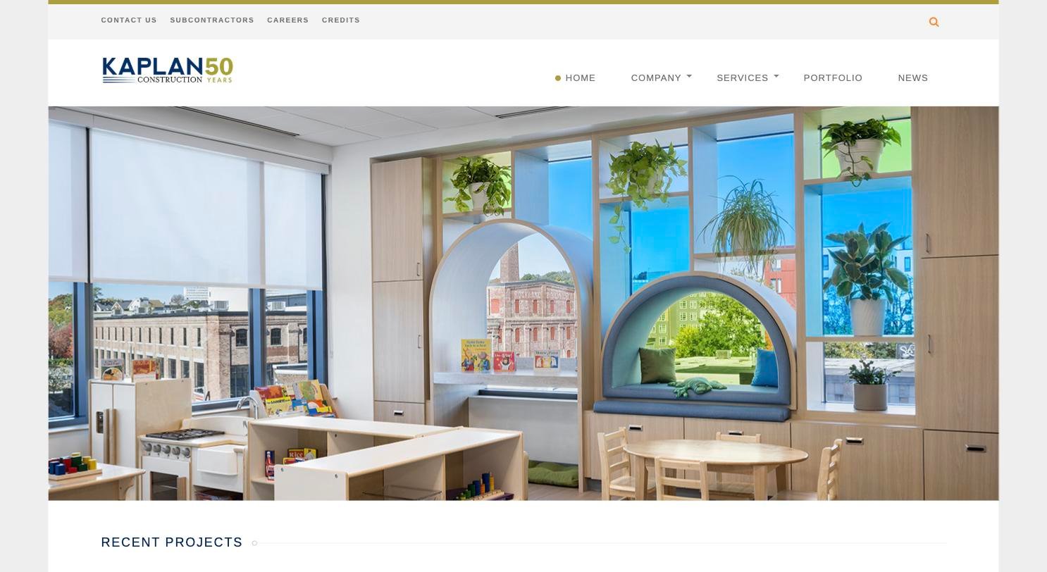
Kaplan does the most useful thing a GC can do on a project page, which is name the client and the architect.
Their page for 2147 Washington Street tells you it ran 99,831 square feet, that the client was New Atlantic Development and the architect was D/R/E/A/M Collaborative, how it was delivered, that it came out to 62 income-restricted rentals plus 12 condos, and that it was built to Passive House standard with LEED Silver expected. Thirteen photos. A developer reads that and knows whether Kaplan has built their kind of building, at their size, with the kind of design team they’re working with.
Most project pages give you a photo and a name.
The team page is the other reason they’re on this list. Twenty-four people with bios, laid out so you can see who’d actually be on your job — a chief estimator, a scheduling manager, a safety manager, six PMs, and eight superintendents named individually, five of them with Passive House credentials listed right there.
What’s missing: they list 116 clients, including Harvard, MIT, Brigham & Women’s and Reebok, and there isn’t a single quote from any of them. Fifty years of relationships and the only person quoted anywhere on the site is their own COO. Six emails would fix that.
Copy this: put the client and the architect on every project page.
Haynes Group — West Bridgewater, MA
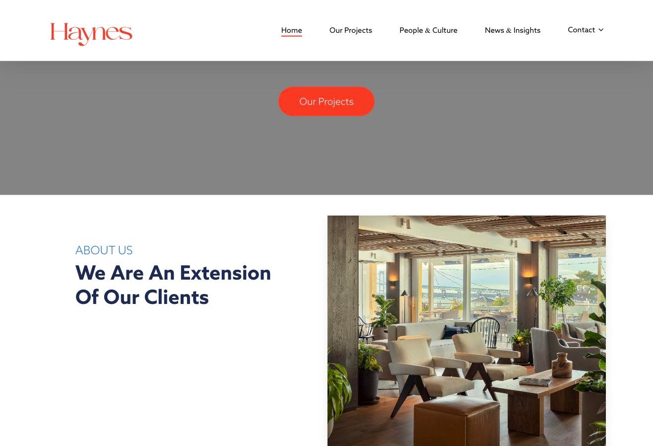
Haynes has the best piece of proof we found anywhere in the twenty, and it’s just a page of quotes.
Ten testimonials, every one from a named person at a named company. Henry Manice, who co-owns Mighty Squirrel Brewery. David Smiley at Newport Harbor Island Resort. Harry Wheeler at Group One Partners, who’s an architect. It covers owners, operators, franchisees and a design partner, which is the range that matters, because all four of those pick GCs.
The portfolio backs it up. Ninety-odd projects sorted into eleven categories, and one of the categories is Brewery — that’s a firm naming a niche it actually owns instead of hiding it under Hospitality.
What’s missing: the project pages themselves are empty. A 352-unit, $20 million job gets five photos and nothing else. No square footage, no value, no architect, no date. They proved on the testimonials page that they can tell a story, and then didn’t do it on the pages where a buyer actually lands.
Copy this: ten named quotes will do more than any amount of copy about your commitment to quality.
Tocci Building Companies — Woburn, MA
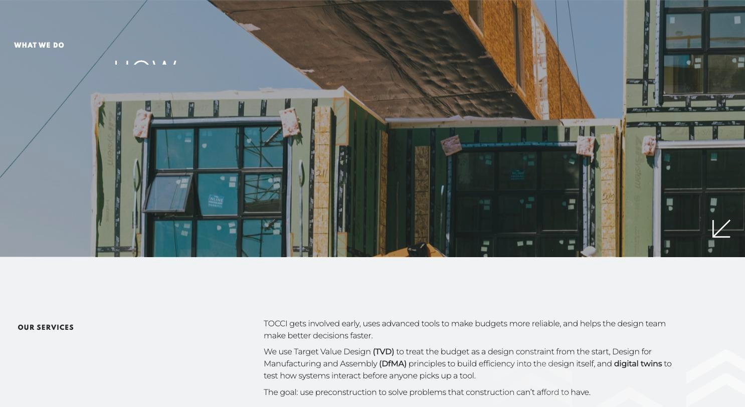
Tocci wrote the only “how we work” page in the twenty that an experienced owner’s rep would actually respect.
It’s four stages, and each one names real methods rather than verbs. Target Value Design, where the budget is treated as a design constraint from day one. Design for Manufacturing and Assembly. Digital twins, so they can test how systems interact before anyone picks up a tool. TAKT scheduling. There’s even a line about de-risking drawings to cut down RFIs, which is a claim somebody could hold them to.
Everyone else on this list wrote Plan / Build / Deliver.
They also have the best contact page in the review, and it isn’t close. There’s no form at all — just a named person, Tammi Gott, with a direct dial and an email, and a link to book fifteen minutes. One firm in twenty does that.
What’s missing: they spent real money on the design and the writing and then put it on a page that won’t hold still. Content jumps around under your cursor while it loads, and on a phone it takes 25 seconds to show you anything. Their homepage video loaded on one visit and came back blank on the next, minutes apart. All that good writing is going out to people who already left.
Copy this: name the methods you actually use, and put a human being on your contact page.
Wolgast Corporation — Saginaw, MI
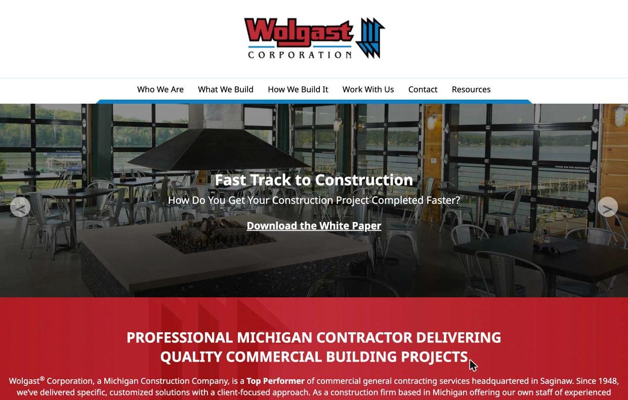
Wolgast has the oldest-looking site in the review and the only working marketing system on it, and you can see both of those in one screenshot.
Centered logo, centered nav, a hero carousel you click through with arrows. The first slide isn’t even aimed at a buyer — it says “Find a Career at Wolgast.” Click once and you get “Fast Track to Construction: How Do You Get Your Construction Project Completed Faster?” with Download the White Paper sitting underneath it.
There are eleven of those white papers, all free, and the titles are written about the owner’s business rather than the building: The Lifetime Cost of Commercial Buildings, Medical Facilities Role in Office Economics: Are You Profitable?, Why Some Business Owners Don’t Do Design/Build, but Should.
Nineteen other firms in this review, one of them a $2.5 billion contractor, have nothing to download at all.
What’s missing: there’s no team page. Not one name, title or face on a 78-year-old employee-owned company. The employee ownership is the best story they’ve got and there are no employee-owners on the site telling it.
Copy this: write for the owner’s business, not for the building.
Large contractors
$100 million to $1 billion
Bigger budgets and some name recognition, but still having to sell.
B.W. Kennedy & Co. — Arlington, MA
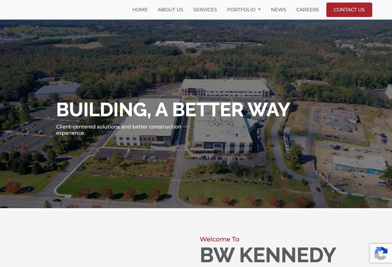
B.W. Kennedy knows exactly who they sell to, and they’ve built the site around that one answer.
The projects menu isn’t called Projects. It’s Life Science, Commercial, Academic, Historic — and Life Science splits again into New Construction, Core & Shell, and Tenant Improvements, which is how a life science developer actually thinks about scope. Somebody running facilities at a biotech lands there and sees NIKON, Arrakis Therapeutics, Bristol Myers Squibb, Dicerna, Voyager. Four seconds and they know they’re in the right place.
There are eight testimonials, all named, and two of them come from architects. Architect references are the ones that genuinely move a GC selection, and hardly anybody publishes them.
What’s missing: twenty seconds to load on a phone, at a firm that builds 750,000 square foot biomanufacturing campuses. Desktop is fast and clean, but mobile is broken, and half the people checking you out are on a phone. They also announced a new business development director in a press release and then left him off the contact page.
Copy this: split your biggest sector by the kind of work, not just the building type.
CM&B — Beverly, MA and New York
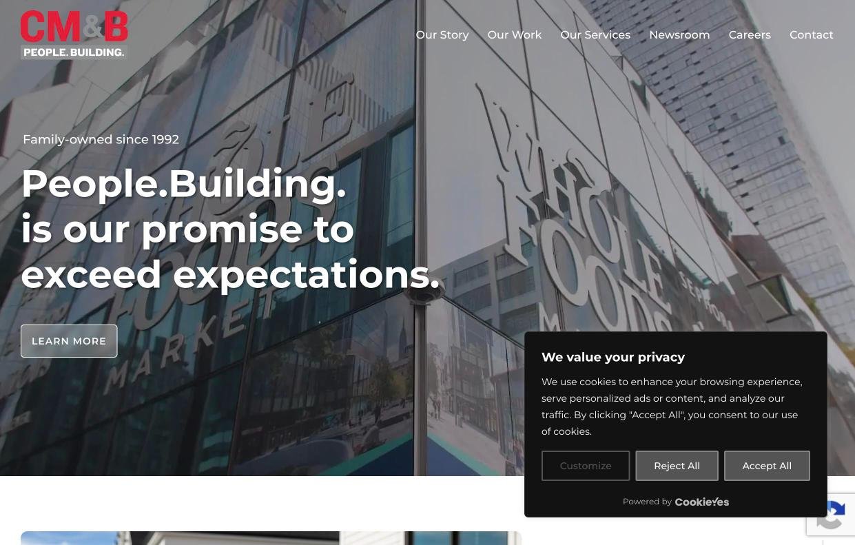
CM&B built the filter a buyer would have designed for themselves.
There are three filters running at once — sector, location and project type — and the project type list includes Occupied Renovation. That isn’t a building category, it’s a constraint, and it’s the exact thing a grocery chain or a hotel shops on. Letting people sort by their situation rather than by building type is a smarter read of how people search than anything else in the twenty.
They’ve got sixty-odd client logos and they’re real ones: Whole Foods, Nike, Amazon, Shake Shack, Wegmans, Nordstrom, Bose, L.L.Bean, Market Basket. That wall does more selling than most contractor websites manage in total. The leadership page runs thirty-eight people, and a whole tier of it is ten named senior superintendents.
The design is the best in the review — full-bleed architectural photography, big clean type, restrained nav. It looks like a firm you’d hand a $40 million job to.
What’s missing: their best numbers, $3 billion in lifetime revenue and 75% repeat clients, are buried three clicks deep while the homepage runs animated counters. And it takes sixteen seconds to load on a phone, which on the best-looking site in the group is a shame.
Copy this: let people filter by their situation, not just by building type.
Commodore Builders — Newton, MA · ENR #256

Commodore has the most human site in the review and they do it two ways.
The team directory runs over 200 people with real headshots, grouped into leadership, operations, about eighty in field operations, and thirty-five estimators and planners. You can look at that page and see the actual crew that would run your job rather than the top of the org chart.
Then the contact page has no form on it at all. Newton and Boston go to Tom Comeau with his real email address, Nashville goes to Brian Day with his, and there’s a phone number. If you want to talk to Commodore, you email a person.
What’s missing: they build cGMP manufacturing for Takeda, Bristol Myers Squibb and Biogen, and there isn’t one word from any of those clients on the site. The homepage does carry a badge row — Boston Globe Top Places to Work, ENR 2025 Top 400, BBJ Top 10, an AGC safety award, veteran-owned — so third-party proof isn’t the problem. Client proof is. Awards tell you judges rate them. A client saying they hit the budget tells you something an award can’t.
Copy this: get rid of the contact form and name the person.
Lee Kennedy Co. — Quincy, MA
Lee Kennedy does one thing nobody else in the twenty does, and it might be the most useful thing on this whole list. They tell you what the job cost.
The Mary Ellen McCormack page reads: Value $65,000,000. Size 112,000 SF. Architect, The Architectural Team. Then the actual scope — demolition and abatement, wood frame on a steel podium, raising the grade for flood mitigation, geothermal.
A developer with a $40 million project reads that and knows in about a second that Lee Kennedy builds at their size. Every filter and sector page on every other site in this review is a roundabout way of answering the question that one number answers outright.
They also let you filter by Current Projects and Upcoming Projects, so you can see what they’re working on now instead of a museum of finished jobs.
What’s missing: there are three people on the team page and all three of them are named Kennedy, which for a firm this size reads as much smaller than it is. No testimonials and no client logos either.
Copy this: publish what the job cost.
Enterprise contractors
$1 billion and up
These are the most impressive sites in the review and mostly the least useful ones to copy.
The big firms are excellent at proving they’re capable and not very good at telling you whether you’re a fit. More projects, deeper benches, better photography — and almost no way for a mid-size buyer to work out whether to pick up the phone. Which makes sense, because when you’re at ENR #45 and running on repeat business, people already know who you are. What you’re looking at is a website built by a company that doesn’t have to sell.
Consigli Construction — Milford, MA · ENR #36
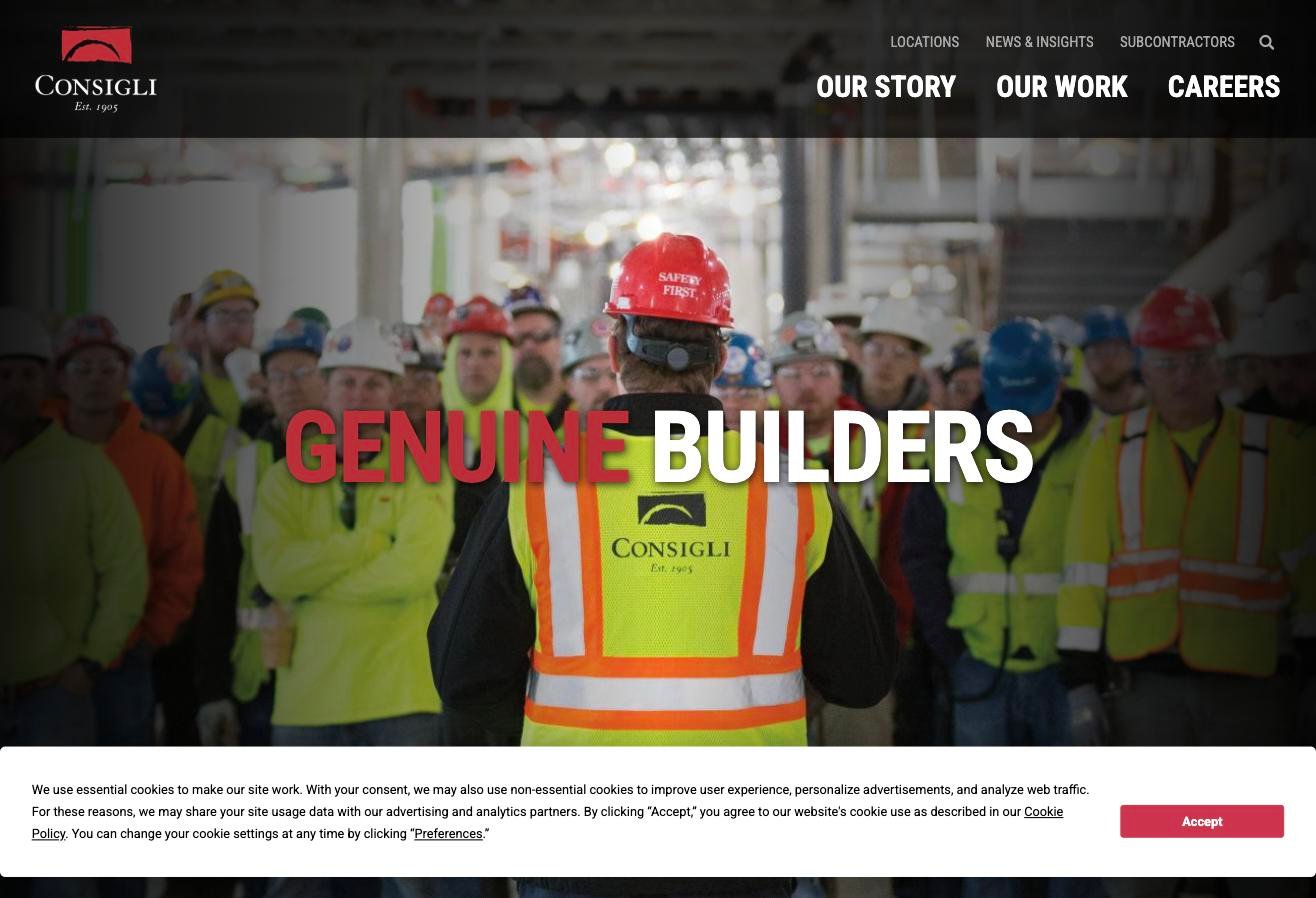
Consigli is the only firm in twenty that just tells you how big it is: $4.4 billion a year, 2,600 employees, 900 carpenters, laborers and masons on staff, fifteen offices from Maine down to the Caribbean. They even publish the growth — 1990, 15 people and $1 million; 2015, 740 people and $1 billion.
That 900 number is the substance behind their self-perform claim, and it ends the argument.
The filter is the best in the review. Seventeen markets with real sub-categories, so Academic splits into independent schools, private university, public university and public K-12, and all of it crosses against thirteen locations. A healthcare developer in Rhode Island gets to Rhode Island healthcare in two clicks.
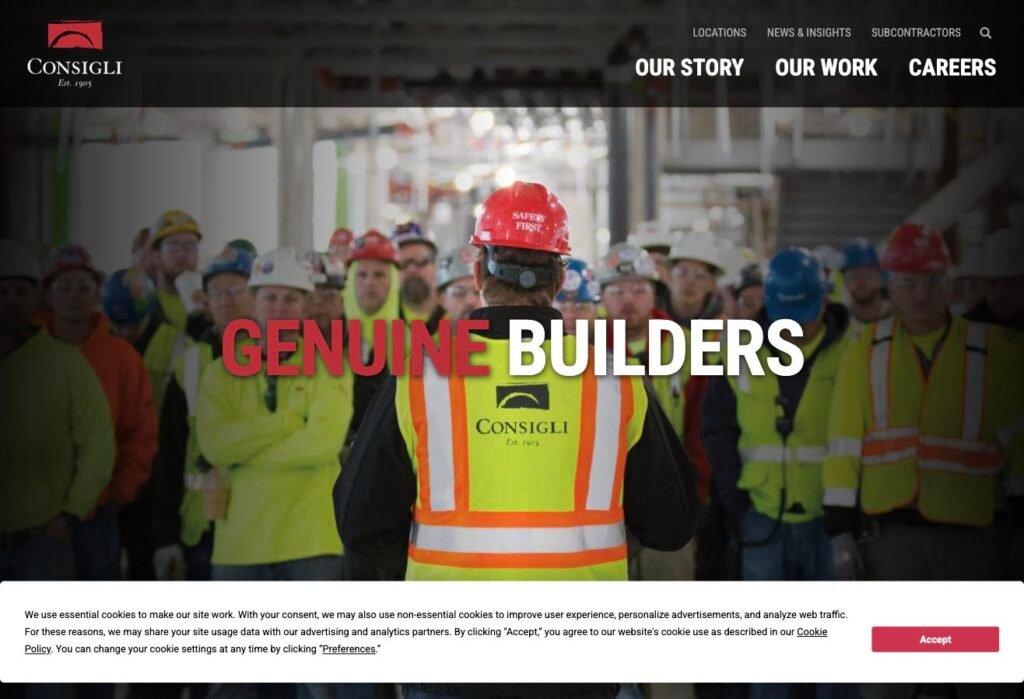
The homepage is a superintendent talking to a crowd of their own tradesmen under the words GENUINE BUILDERS, which backs up that 900 number better than any copy could.
What’s missing: their project pages aren’t in the sitemap at all, so hundreds of pages of portfolio work are invisible to search. And there’s no leadership page — the closest thing to one is a recruiting page.
Copy this: publish your real numbers.
Clune Construction — Chicago · ENR #45

Clune built one excellent sector page and nine ordinary ones, and the good one is worth studying.
The Mission Critical page carries 1.4 gigawatts in active projects, $2.6 billion in data center work for 2025, and 500 people dedicated to it, alongside eight projects with real numbers on them — Prime Data Centers Elk Grove at 1.03 million square feet and 275MW, Serverfarm Houston at 430,000 square feet and 60MW. Then it names two managing directors right there on the page.
A data center developer can land on it from a search and come away knowing the scale, the megawatts and who to call, without ever finding the contact page. That’s what a sector page is supposed to do.
What’s missing: the healthcare page gets none of that treatment. Nine projects, no numbers, no named leader, and it’s the same story for education, hospitality and the rest. They proved they know how to build a sector page and then didn’t do it another nine times.
Copy this: put real numbers and a named person on every market page.
Messer Construction — Cincinnati · ENR #73
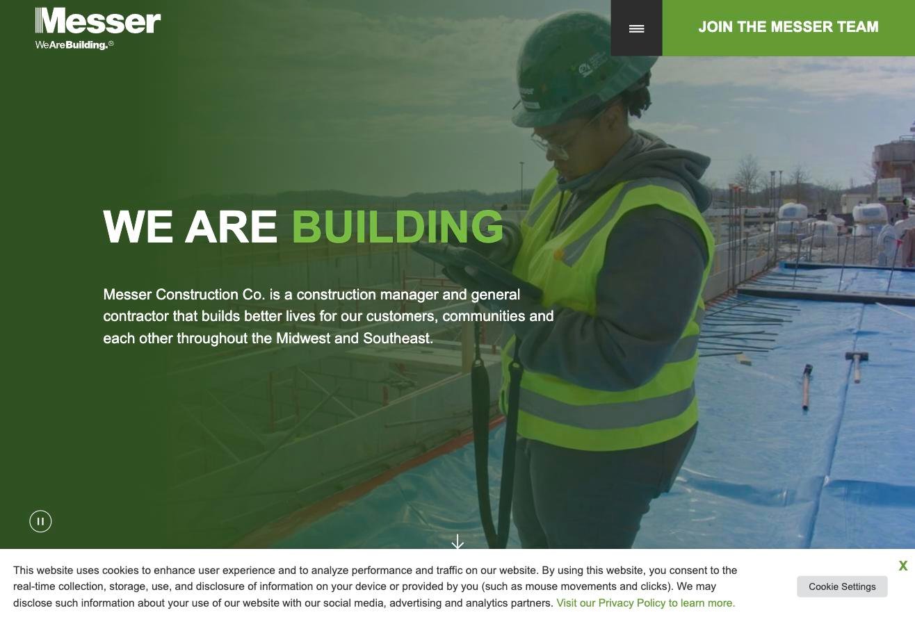
Messer publishes around 200 named people with headshots — board, executives, officers and roughly 130 senior managers — and that senior tier includes project executives, general superintendents and estimating principals. That’s more useful depth than most $50 million GCs manage.
They also name the person who owns each market, so Carl Dennin runs healthcare and Nick Proffitt runs higher education. That’s the closest anything in twenty sites gets to telling you which human is responsible for your kind of work.
And they publish their whole ENR ranking sheet rather than just the headline number: #11 in R&D, #18 in healthcare, #23 in education, plus sixteen regional rankings. Most firms show an ENR badge with no number attached to it at all.
What’s missing: the buyer’s path is broken while the recruiting path is polished. The biggest button on the homepage is “Join The Messer Team,” and it’s the only button — there’s no visible Contact link anywhere, everything else sits behind a hamburger menu. The projects page shows “there are no projects that match those filters” before it finishes loading, filtered project pages are blocked from search entirely, and there’s a region called “Test Region” live on the site.
Copy this: name the person who owns each market.
W.E. O’Neil Construction — Chicago · ENR #95
W.E. O’Neil took their best sales argument and turned it into a button.
The projects page filters four different ways and one of them is Repeat Client. Another is Under Construction. So a multifamily owner can pull up multifamily projects in their region where somebody hired W.E. O’Neil twice, all in one view. The homepage claims 80% repeat business and the filter lets you go and check it yourself.
There are twelve-plus testimonials, all named — Dan McCaffery at McCaffery, Robert Janis at DePaul, Erin Bagnall at Sopher Sparn Architects — plus sixteen client logos including Hines, United, Nordstrom and Equity Residential, and $1.5 billion in revenue with 500 employee-owners published right on the homepage.
What’s missing: the news section has no dates on anything, features a 2023 intern post in a prime slot, and prints “No matches found matching your criteria” at the bottom of the live page. The newest thing anybody can date on there is from October 2025. Thirteen offices on the contact page with no phone numbers and no names on any of them.
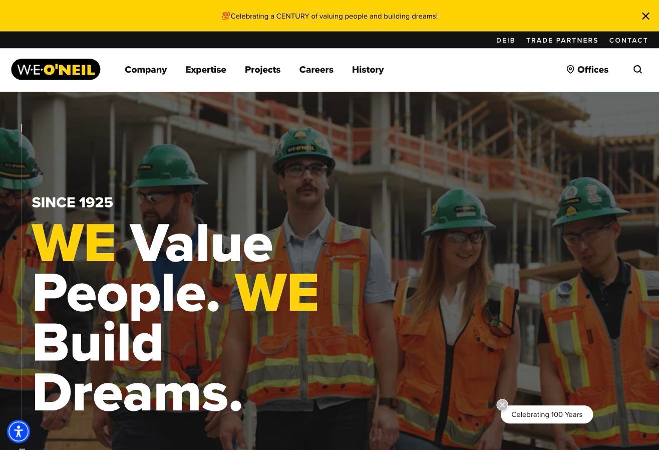
The hundred-year anniversary is also eating the homepage. You get a “Celebrating a CENTURY” banner, “SINCE 1925,” the headline “WE Value People. WE Build Dreams.” and a floating “Celebrating 100 Years” badge, all on one screen, and none of them tell a developer what the firm builds.
Copy this: let people filter for repeat clients.
What we found across all twenty
What the good ones do
They put real information on their project pages. Kaplan tells you the client and the architect. Lee Kennedy tells you what the job cost. Clune puts megawatts on the data center projects. Somebody reading those pages can work out whether this firm has built their kind of building, at their size, with the kind of design team they’re using — which is the whole question they came to the site with. Weak project pages give you a photo, a project name, and a paragraph about a commitment to quality, and leave the reader exactly where they started.
They make it easy to find work like yours. Two ways to do this and both work. If you really only do one or two things, say so plainly — Haynes does breweries, B.W. Kennedy does life science, Wolgast does school work before the bond vote goes out. If you do six things, don’t cram them into a sentence on the homepage. Give each one its own page with its own projects, its own numbers and its own person to call, and let people filter down to their kind of job quickly.
The best examples here filter the way a buyer actually thinks rather than the way an org chart is arranged. CM&B lets you sort by Occupied Renovation, which isn’t a building type at all — it’s a constraint, and it’s the thing a grocery chain or a hotel is really shopping on. Consigli splits Academic into independent schools, private university, public university and K-12. W.E. O’Neil lets you filter for Repeat Client and pull up the jobs where somebody hired them twice.
They get somebody else to vouch for them. Haynes has ten testimonials, every one from a named person at a named company. W.E. O’Neil has twelve. B.W. Kennedy has eight, and two of those are from architects, which are the references that genuinely move a GC selection. Worth saying plainly: your own copy about quality and integrity does nothing at all. A named client saying you came in on budget does everything.
They show the people who’d actually run your job. Commodore has eighty field staff on the site, Kaplan names eight superintendents, Messer lists general superintendents and estimating principals, CM&B has ten senior supers.
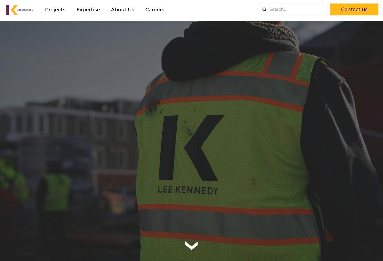
And the good ones don’t keep the photos locked away on one team page either. People turn up all through the site — on project pages, in the news section, out on the job in their own vests. Consigli’s homepage is a super talking to a crowd of their own tradesmen, and Lee Kennedy’s is a guy in a company vest with his back to the camera. You get a feel for who these companies are before you’ve read anything. Most sites give you five executive headshots on an About page and stop there.
They tell you how big they are. Consigli publishes $4.4 billion a year, 2,600 employees and 900 tradespeople on staff. W.E. O’Neil puts $1.5 billion and 500 employee-owners on the homepage. CM&B has $3 billion in lifetime revenue and 75% repeat clients. Numbers like that do two jobs at once — they tell a big developer you can handle the work, and they tell a smaller one whether they’re about to waste everybody’s time. Most firms publish nothing and leave both of them guessing.
They show what they’re building right now. Lee Kennedy filters projects into Current and Upcoming. W.E. O’Neil has an Under Construction filter. It’s a small feature that answers a question people ask quietly — is this company busy, and are they busy with work like mine. A portfolio of finished jobs going back fifteen years doesn’t answer that on its own.
They explain how they actually build. Tocci’s process page names Target Value Design, Design for Manufacturing and Assembly, digital twins and TAKT scheduling, and talks about de-risking drawings to cut down RFIs. Whether or not a reader knows every one of those terms, they can tell the difference between that and Plan / Build / Deliver. One of them was written by somebody who runs jobs and the other was written to fill a page.
They put a real person on the contact page. Most contractor sites end at a form, where you type your project into a box and hope somebody reads it. Three of the twenty give you a person instead — a name, an email, a direct line — and Tocci goes further and lets you book fifteen minutes on a calendar without having to talk to anyone first. If somebody’s interested enough to reach out, that’s the worst possible moment to make them wonder whether it went anywhere.
What almost nobody does
Nobody offers a capability statement to download. Not one of the twenty. Every one of these firms has that PDF sitting on a server somewhere, because it goes out with every RFP response — but none of them will hand it to somebody who isn’t ready to talk yet, and that’s exactly the person who needs something to send his boss.
Almost nobody puts a person on the contact page. Three out of twenty. A few firms name a business development director on the team page and then don’t give you his email or phone number, and one of them announced a new BD director in a press release and still left him off the contact page. A lot of contact pages are built for subs, too — one $2.5 billion contractor’s main contact form is titled “Become a Subcontractor.” Their front door is set up for the people selling to them rather than the people buying from them.
Mobile is broken almost everywhere. The load times we measured were 25.6 seconds, 20.6, 19.7, 17.2 and 16.1. Somebody checking you out from their phone between site visits is long gone before your photos show up.
Spending more doesn’t get you a better website
In this review it was close to backwards. The firm with the best photography takes 19.7 seconds to load on a phone, and the oldest-looking site of the twenty is the only one with a real way to capture a lead.
Most of what separates the good sites here from the bad ones is free. Testimonials are an afternoon of emails. A name and a direct line on the contact page costs nothing. Photos of your crew are already sitting on somebody’s phone. What actually costs money is speed and design, and neither of those rescues a site that’s missing everything else.
Two more worth mentioning, because they’re free to fix and they quietly cost you work. One builder has a page called “Recent News” where the newest item is Safety Week 2020 — if you can’t keep a news section current, take it down, because an empty one answers a question you didn’t want asked. Another did $2.5 billion last year and let their old web address lapse to a squatter, so put a reminder on the calendar for the renewal and check that the old addresses still point where you think they do.
What your website should include
Roughly in the order of how easy they are to do.
Photos of your people, all through the site. Not one page of headshots — your crew on the job, your PM at a site walk, the office. It’s the cheapest trust you’ll ever buy and most of the pictures already exist on somebody’s phone.
Three testimonials with real names. A person, their company, and something specific about the job rather than “a satisfied client.” Realistically that’s an afternoon of emailing four or five clients you’re on good terms with and asking for two sentences.
A person on the contact page. A name, an email and a direct line. If you’ve got a BD guy, this is his job showing up on the website.
The size of projects you specialize in. One sentence on the homepage — something like “we build $3M to $25M commercial projects across New England.” Without it a developer is guessing, and when people guess they tend to guess low and call somebody else.
A page for every market you work in, with its own projects, its own numbers and its own person to call.
A capability statement people can download. You already have the PDF. Put it behind a form and it turns somebody who wasn’t ready to call into a name you can follow up with, and it gives the guy who likes you something he can forward to his boss.
Project pages with the actual details — client, architect, square footage, delivery method, when it finished. And what it cost.
That last one is the part people argue with, so it’s worth going through properly.
The pushback is always some version of “I’m not publishing my numbers.” But that’s about bid numbers, and this isn’t that. A finished project value isn’t your margin and it isn’t your rates — it’s the contract value of a job that’s already done. On public work it’s public anyway. It’s in the business journal, it’s in bldup, it’s in the owner’s board minutes. You’re not giving away anything a competitor couldn’t dig up in twenty minutes.
What you get for it is a developer with a $4 million renovation landing on your site and knowing in one click whether you’re interested. Lee Kennedy publishes $65,000,000 on a project page and they’re the only firm in twenty doing it, so if you do it too you’ve matched the most useful page in this review for about an hour of typing.
And if you genuinely can’t — confidential clients, or an owner who’d object — put square footage and a range on there instead. That gets you most of the way.
A site that works on a phone. This is the one that costs money. Open yours on cell service rather than office wifi, and if nothing has shown up in four seconds, you’re losing people you’ll never hear about.
Run the five checks on your site
Everything above except that last one is free and takes about a week, and nobody in this review has done all of it.
If you’d rather we did it, send us your URL. We’ll run the same five checks we used here and tell you what we’d change — takes us about twenty minutes.